Category: Design

The Evolution of the Chapter: From Malory's Morte d'Arthur to Austen's Age

2025-08-31
The Evolution of the Chapter: From Malory's Morte d'Arthur to Austen's Age

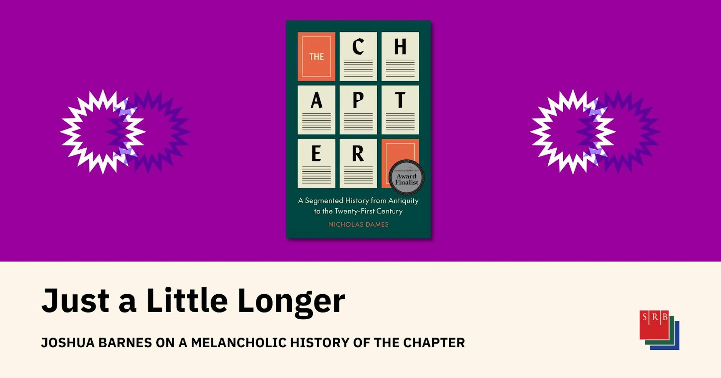
This essay explores the history of novel chapter divisions and their evolution. It begins with the revelation that the chapter breaks in Malory's 15th-century *Morte d'Arthur* weren't his, but additions by the printer Caxton, altering the text's rhythm and tension. The essay traces the evolution of chapters from medieval times to the 18th century, where their function shifted from simple text segmentation to a complex tool shaping narrative pacing and reader experience. Analyzing various authors' uses of chapters – including Sterne, Fielding, Equiano, and Goethe – the essay reveals the interplay between chapter form, narrative strategies, social change, and reader subjectivity. Ultimately, it argues that chapter divisions aren't merely technical devices, but profound constructions of time and narrative experience.

Beyond Metrics: The Feeling of User Experience

2025-08-30

Checkboxes checked. Requirements met. Demo done. But did you *feel* it? This article argues that successful products aren't just about meeting specifications; they evoke feelings in users. Joy, satisfaction, ease of use – these are crucial elements often missed in metrics and demos. The author emphasizes the importance of developers truly using and living with their work to understand and create products that resonate emotionally with users. It's not just about checking boxes; it's about feeling the experience.

Nokia Sans as a UI Font: A Surprisingly Good Choice

2025-08-30

A nostalgic journey into the world of Nokia's iconic Nokia Sans font. The author, driven by sentimentality, experimented with using it as a user interface font. Despite the difficulty in finding a complete font set, they managed to install various variants and discovered Nokia Sans Wide to be surprisingly legible and charming. The post shares a personal experience and touches upon the font's performance across different systems and DPI settings, as well as legal considerations.

Design

Areal: Are.na's Custom Typeface – A Revival of Arial

2025-08-27
Areal: Are.na's Custom Typeface – A Revival of Arial

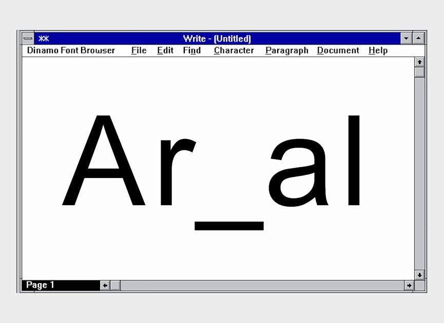
Are.na, in collaboration with design studio Dinamo, unveils Areal, a custom typeface. Instead of a simple copy, Areal is a meticulously redrawn and rebuilt "revival" of Arial, based on its earliest internet version. This collaboration stems from a shared design philosophy and a deep exploration of Arial's history and cultural significance. Areal boasts technical improvements and dark mode optimization, enhancing user experience. The update acts as a refresh for Are.na, retaining its original style while incorporating modern design principles.

Design

Nostalgic Retro: Blue Beings in a 1960s Recording Studio

2025-08-26
Nostalgic Retro: Blue Beings in a 1960s Recording Studio

A faded photograph captures a 1960s recording studio scene featuring two blue characters in the control room, bathed in the warm glow of vacuum tubes and a large mixing console. The larger figure, wearing slightly askew headphones, peacefully observes a musician through soundproof glass. The smaller character, perched on a stool and sporting tiny round glasses, meticulously adjusts a knob on a reel-to-reel tape machine. The aged photo's grainy texture, soft focus, and desaturated warm tones evoke a strong sense of nostalgia, transporting viewers back to a musically vibrant era.

macOS Tahoe's Utility App Icons: Dead Canaries

2025-08-26
macOS Tahoe's Utility App Icons: Dead Canaries

The new utility app icons in macOS 26 Tahoe Beta 7 are drawing heavy criticism. The author argues the new icons, all using a lazy wrench motif, are objectively terrible. Only a small portion of the icon represents the app's function, the rest being dominated by a poorly designed wrench and bolt. The design is criticized for its lack of detail and poor execution, exemplified by the Disk Utility icon being simply an Apple logo. This is seen as a canary in the coal mine, indicating deeper problems with Apple's design sensibilities.

Design icon design

OKLCH: A Perceptually Uniform Color Model Revolutionizing Design

2025-08-25
OKLCH: A Perceptually Uniform Color Model Revolutionizing Design

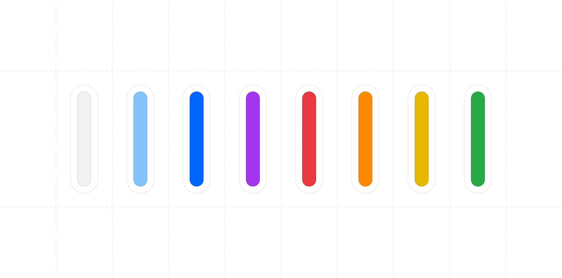
OKLCH is a new color model designed for perceptual uniformity, offering a significant improvement over traditional models like RGB and HSL. It more accurately reflects how humans perceive color, making color manipulation easier. Based on the OKLab color space, OKLCH uses Lightness, Chroma, and Hue values. Maintaining consistent lightness while changing hue creates visually uniform palettes, while varying lightness produces shades without hue or saturation drift. OKLCH also excels in gradients, color space support, and maximum chroma definition. Modern browsers support it well. The author created oklch.fyi, a tool for generating OKLCH palettes and converting colors.

The Artist Behind TWA's Iconic Posters: David Klein

2025-08-23
The Artist Behind TWA's Iconic Posters: David Klein

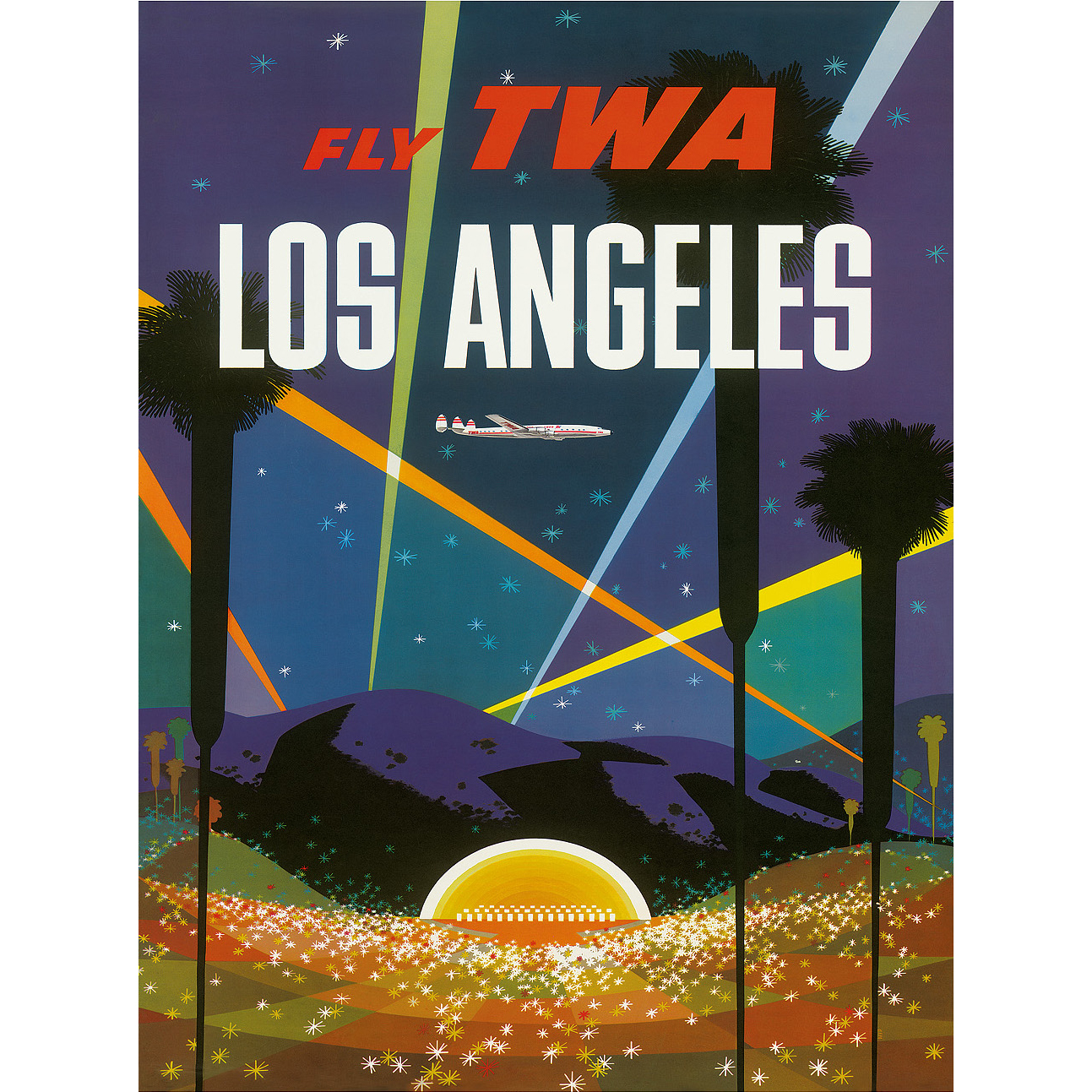
David Klein, an illustrator and artist best known for his stunning posters for Trans World Airlines (TWA) in the 1950s and 60s, left a lasting legacy. TWA, one of the world's most admired airlines at the time, was a pioneer – the first to hire an African-American stewardess, introduce in-flight movies, and utilize the Boeing 747. After illustrating army manuals during WWII and working as an art director for Broadway, Klein's TWA posters became his most celebrated work, capturing the excitement of post-war air travel with a timeless style that continues to resonate today.

Design

C-Tubes: Revolutionizing 3D Design with Flat Materials

2025-08-22
C-Tubes: Revolutionizing 3D Design with Flat Materials

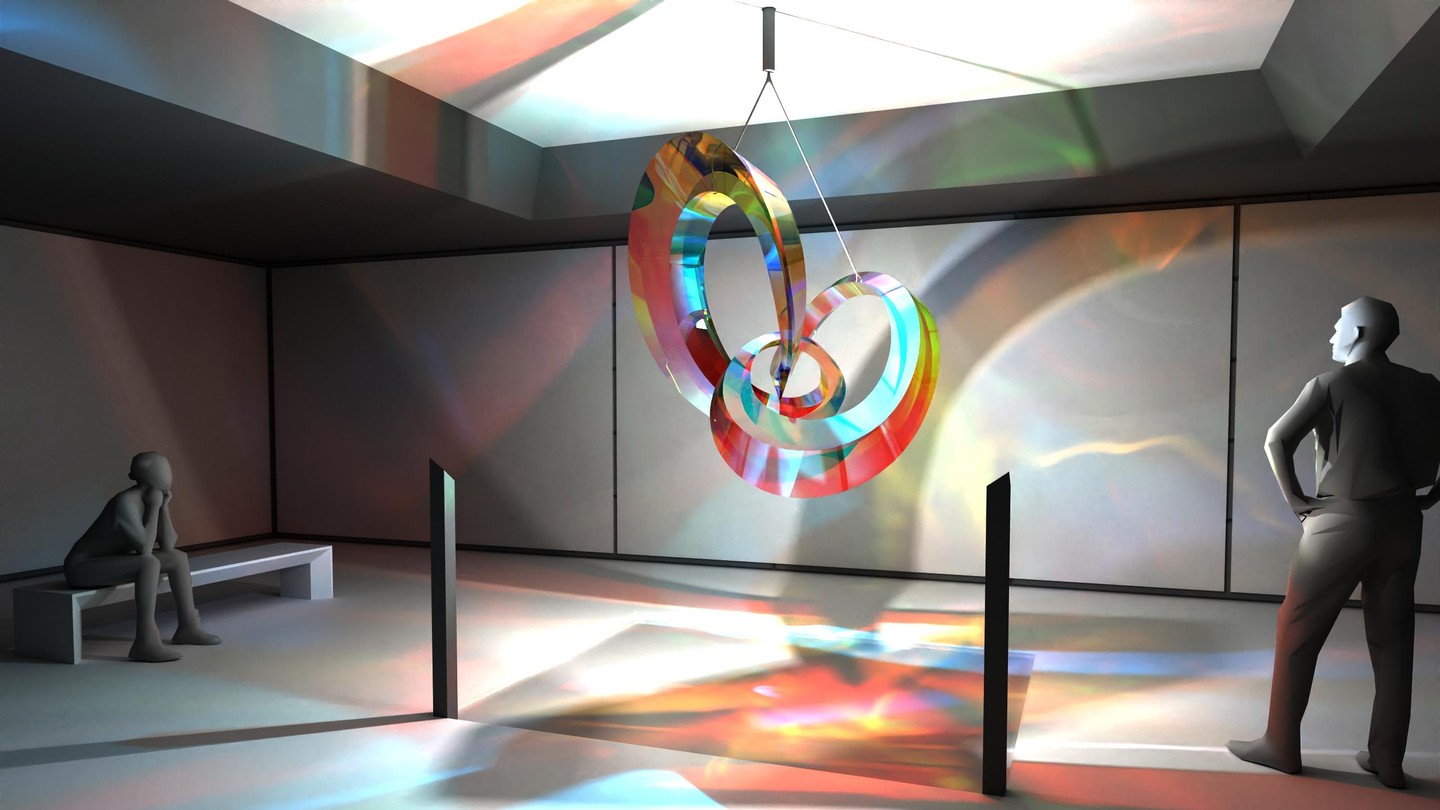
Researchers at EPFL's Geometric Computing Laboratory have developed C-Tubes, a groundbreaking method for creating strong, lightweight curved structures from flat strips of material. Their algorithm precisely bends and connects these strips, avoiding stretching or wrinkling, resulting in surprisingly stiff and durable tubes. This sustainable approach minimizes waste and opens possibilities in furniture, lighting, architecture, and beyond. C-Tubes promises to revolutionize design and construction, offering a more efficient and environmentally friendly approach to 3D object creation.

Design

The Delight of Visual Rhyme: How Patterns in Art Create Pleasure

2025-08-21
The Delight of Visual Rhyme: How Patterns in Art Create Pleasure

This article explores how the interplay of repetition and variation in art creates aesthetic pleasure. Using Gustave Caillebotte's "Paris Street; Rainy Day" as a prime example, the author analyzes the repetition and subtle variations of geometric shapes like triangles and rectangles, and how these patterns trigger visual satisfaction in the brain. The article further examines Lee Friedlander's photograph "Albuquerque, New Mexico," and works by Roni Horn and Ormond Gigli, arguing that the "same-but-different" repetition patterns in various art forms generate visual rhyme, leading to aesthetic enjoyment for the viewer.

Design

Relive the 80s: Epson MX-80 Font Pack Released

2025-08-21

Michael Walden has recreated the fonts from the iconic Epson MX-80 dot matrix printer, popular in the 1980s. Manually transcribing the font data, he's expanded the character set to include Windows-1252 characters and offers the fonts in various formats (.fon, .ttf, .otf, .woff, .woff2). Perfect for retro printing simulations or displaying program listings on web pages and in documentation.

Design retro font

Geotoy: Open-Source 3D Modeling Tool Showcases Stunning Artist Portfolio

2025-08-19

Geotoy, a completely free and open-source 3D modeling tool by Casey Primozic, is showcased through a stunning portfolio of 3D models created by artist ameo. The collection includes a diverse range of creations, from a 3D Hilbert curve and shingles to a temple, maze, spring, fractal terrain, torus knot, dandelion, power line, woven structures, roots, bumpy sphere, abstract hourglass, birdbath, concrete tetrapod, terraced floating island, extruded clay bowl, advanced shader props, superellipse dominos, and even a Dark Souls-inspired tree. This impressive display highlights Geotoy's capabilities and ameo's artistic talent.

Design

Revolutionary Digital Painting Software: True Pigment

2025-08-16
Revolutionary Digital Painting Software: True Pigment

True Pigment is an open-source digital painting software featuring a groundbreaking dual-component pigment canvas. This canvas stores the spectral reflectance and transmittance of pigments, enabling physically accurate color mixing, even for opaque and transparent colors. The software also offers flexible lighting controls, accurate color management (including sRGB, AdobeRGB 1998, and D65 P3 color spaces), and CMYK soft proofing. Developed by Wu Yiming, it's licensed under GNU GPL v3 or later for individual use.

The Chrome-Tastic Airbrush Art of the 80s: A Nostalgic Look Back

2025-08-15

The 80s saw airbrush art explode in popularity. The author recounts their teenage yearning for an airbrush, dreaming of painting band logos and making money. While computer design eventually took over, the author fondly remembers the unique chrome effects, gradients, and speed lines of 80s airbrush art. Digital art today perfectly replicates the style, but lacks the organic imperfections of the original. The author hopes to one day rediscover their old airbrush and revisit this iconic art form.

The Pains and Pleasures of Typeface Licensing: A Designer's Perspective

2025-08-14
The Pains and Pleasures of Typeface Licensing: A Designer's Perspective

A designer shares their experiences navigating typeface licensing across numerous projects. High-quality commercial fonts and supporting independent foundries are key considerations. However, varying licensing terms from different foundries create complexities. The article explores ideal licensing features: clear and easily accessible terms, shareable shopping carts, straightforward payment options, flexible pricing models, and the ability to subset fonts. The author highlights the need for a balance between foundry needs and client usability for a smoother workflow.

Pen Plotter Limitations: Speed and Color Challenges

2025-08-14
Pen Plotter Limitations: Speed and Color Challenges

While pen plotters offer speed and precision advantages over hand drawing, they are significantly slower than inkjet printers, making large-scale artwork production time-consuming and limiting edition sizes. Multi-color plotting presents further challenges, requiring manual ink or paint changes and leading to potential misalignments. The author even designed a 3D-printed pen holder to address alignment issues but still requires manual pen switching. Compared to professional printing, pen plotters fall short in resolution and color accuracy.

Design drawing

Tetris in a Home Studio: Mastering Space Optimization

2025-08-13
Tetris in a Home Studio: Mastering Space Optimization

This article details the author's ingenious approach to transforming a limited space into a multi-functional home studio for music production, gaming, and work. Equipment was segmented into four distinct zones, prioritizing ergonomics and minimizing interference. Large musical instruments dominate the back wall, while monitors leverage hidden space and adjustable arms for flexibility. A custom-built flight simulator dashboard and clever cable management (nearly 700 feet!) complete the setup, resulting in an efficient and aesthetically pleasing workspace.

Millau Viaduct: Where Architecture Meets Engineering

2025-08-11
Millau Viaduct: Where Architecture Meets Engineering

The Millau Viaduct transcends the typical bridge; it's a masterful blend of architecture and engineering. Its elegant cable-stayed design gracefully spans the Tarn River gorge, achieving both aesthetic beauty and structural efficiency. Setting multiple world records with its height and span, the viaduct's slender form minimizes its environmental impact, showcasing a triumph of modern bridge design.

Nine Years of NYC Commute: A Street Photography Project

2025-08-07
Nine Years of NYC Commute: A Street Photography Project

For nine years, Danish photographer Peter Funch captured the daily morning commute at the corner of 42nd Street and Vanderbilt Avenue in New York City. His project, "42nd and Vanderbilt," presents a unique perspective on the subtle changes and unchanging habits of commuters. By photographing the same individuals multiple times over the years, Funch invites viewers to ponder the unnoticed details of daily life, the fleeting moments of solitude amidst the urban bustle, and the spectrum of emotions—from anxiety to tranquility—reflected in the commuters' faces.

Photographer and Chef Bourdain: Marrow, Tequila, and The Last Supper

2025-08-06
Photographer and Chef Bourdain: Marrow, Tequila, and The Last Supper

This article recounts the behind-the-scenes story of a photographer shooting a portrait of renowned chef Anthony Bourdain for her photography book, "My Last Supper." From the nervous preparation to unexpected moments during the shoot, and finally to the success of the photograph and Bourdain's own evaluation of it, the author uses delicate strokes to depict the friendship and shared pursuit of art between the two, as well as the complex emotions and meanings behind the photograph. Ultimately, a picture of Bourdain holding his daughter becomes a testament to their friendship and reflects the enduring charm of photographic works.

Beyond Flashy Signs: A Deep Dive into India's Street Lettering

2025-08-05
Beyond Flashy Signs: A Deep Dive into India's Street Lettering

For a decade, Pooja Saxena has documented the vibrant street lettering of India, revealing a depth beyond the commonly perceived flashy signage. Her work showcases diverse forms, from ribbon lettering in metal to mosaic and wood techniques, each reflecting unique regional styles. Through interviews with artists like Delhi's Mohanlal Sihani, she unveils the trust-based process and the creative independence that imbues Indian cities with distinctive typographic flavors. Viewing the art through a typeface designer's lens, Saxena highlights the influence of traditional printing techniques and celebrates the artists' ingenuity in handling limited spaces and multilingual scripts. Her book is not just a visual feast but a profound exploration of Indian street culture.

(bl.ag)

The Tyranny of Annoying Device Sounds: My Car, Washing Machine, and Baby Monitor Gone Wrong

2025-08-04

The author rails against the excessive noise notifications from modern smart devices. From a car's low fuel level alert to a washing machine's button beeps and a baby monitor's startup sound, these noises are not only disruptive but also pose safety risks (e.g., the car alert being distracting while driving at high speed). The author calls on designers to prioritize user needs when designing products and to reduce unnecessary noise pollution, using examples from their own home (dishwasher, refrigerator, and e-reader) to show that quiet design is possible.

Design

Australia's Youngest Art Director: The Making of Bluey

2025-08-04
Australia's Youngest Art Director: The Making of Bluey

In 2017, the author rejoined Ludo Studio, working on various 2D animation projects. He was then invited to be the art director for the children's show, Bluey, becoming Australia's youngest art director for an animated series. The director's love for Brisbane fueled a desire to showcase the city's unique beauty in the animation. Initial design phases combined Brisbane's stunning scenery with fundamental animation design principles, ultimately creating the acclaimed show.

Universal Logo's Untold Story: A Six-Month Masterpiece of Light and Shadow

2025-07-31
Universal Logo's Untold Story: A Six-Month Masterpiece of Light and Shadow

The creation of Universal Pictures' iconic logo is a tale of ingenuity and painstaking effort. Art director Alexander Golitzen, using plexiglass, phosphorescent coatings, and multiple exposures, spent six months crafting the mesmerizing rotating globe and stars. Thin plexiglass stars, coated with silver-activated zinc sulfide for high reflectivity, were individually rotated with multiple lights and filmed with a narrow aperture. The globe, painted black with an interior phosphorescent coating, had the title added in a separate pass. Multiple projections and exposures, along with a second, larger globe, were used to create the final effect. The logo's design even inspired the 'Interociter' device in the 1955 film 'This Island Earth'.

Why Your iPhone Photos Don't Make for Great Prints

2025-07-30

Ever wonder why you rarely see smartphone photos printed and framed? This article explains why. By comparing iPhone photos to those from a professional camera, the author highlights several key differences. iPhone's fisheye lens creates distortion, especially noticeable in body posture and facial features. The computational photography attempts to brighten everything, sacrificing crucial facial details and shadow accuracy. The background blur (bokeh) is also far less natural and pleasing than that produced by professional cameras. In short, while convenient, iPhone photos lack the detail and realism suitable for prints and framing.

Design image quality

Truchet Tiles: Simple Geometry, Infinite Possibilities

2025-07-29

Truchet tiles, simple square tiles with non-rotationally symmetric patterns, create surprisingly complex and captivating visual effects. First described in 1704 by Sébastien Truchet, they're now widely used in information visualization and graphic design. By varying the tile orientations, diverse patterns emerge, even creating labyrinths. Their elegant simplicity extends to programming; a single line of code can generate endless variations, highlighting the beauty of concise algorithms and infinite possibilities. This makes them a prime example of generative art.

Optimal Image Resolution for Printing: Debunking the 300PPI Myth

2025-07-28

This article delves into the optimal practices for printing image resolution. While the conventional wisdom suggests 300PPI is sufficient, the author argues this overlooks viewing distance and human eye resolution. Using formulas and real-world examples, the article demonstrates how to calculate the appropriate PPI based on viewing distance, highlighting that in the modern era of high-resolution cameras, higher PPI is necessary to fully leverage lens capabilities and achieve optimal print quality. Ultimately, the author encourages readers to experimentally determine their own eye resolution to achieve the best print settings for their individual needs.

CNC Bed Frame Design & the Search for the Perfect 2D CAD Tool

2025-07-28

The author is designing a CNC-cut bed frame from a single sheet of plywood. He explores various design approaches and software options, starting with Autodesk Inventor but finding it cumbersome for 2D cutting. The article compares several 2D CAD tools, including Cuttle, FlatFab, and Kyub, highlighting their strengths and weaknesses. The author ultimately leans toward a parametric CSG approach and shares experiences optimizing his code-based CAD system using Clojure Zippers.

Sixteen Colors: An Online Archive of ANSI/ASCII Artpacks

2025-07-27
Sixteen Colors: An Online Archive of ANSI/ASCII Artpacks

Sixteen Colors is an online archive preserving ANSI and ASCII artpacks, a form initially designed for text-mode computer consoles. Popularized in the early 90s with the rise of dial-up Bulletin Board Systems (BBSs), artists formed groups releasing monthly artpacks, sparking fierce competition (like between ACiD and iCE). The internet's rise in the late 90s diminished BBSs and the demand for ANSI/ASCII art, yet artists continue the tradition. Sixteen Colors aims to publicly archive this legacy. For more context, watch "THE ART OF WAREZ," a short film exploring the scene's origins.

Design ANSI art

Retro Web Design Element Frequency: A Nostalgic Palette Returns

2025-07-23

This data summarizes the frequency of over 100 retro web design elements, encompassing colors (blue is most prevalent, followed by green and multicolor), patterns (animal prints, geometric shapes, florals, etc.), and themes (tech, nature, etc.). The data reveals trends in popular retro web design elements, offering a reference for designers and illustrating a nostalgic web aesthetic.

Design
← Previous 1 3 4 5 6 7 8 9