Category: Design

SVG Favicons: Dark Mode Elegance

2025-05-27
SVG Favicons: Dark Mode Elegance

This article explores creating website favicons that support dark mode using SVG. While SVGs don't always win on file size compared to PNGs, they offer easy dark mode switching via inline CSS and media queries, avoiding complex image editing. The article details two approaches: manually editing SVG code to add CSS styles, and using online tools like RealFaviconGenerator for quick generation. Ultimately, the author highlights SVG favicons' unique advantage in solving dark mode display issues and looks towards future applications.

Design

Fake It Till You Make It: $200 Museum-Quality Art

2025-05-26
Fake It Till You Make It: $200 Museum-Quality Art

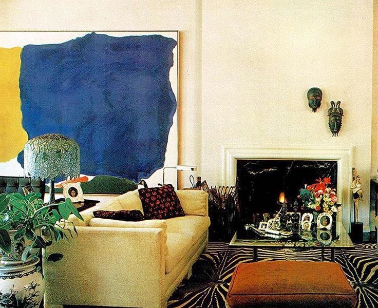
Want that high-end, gallery-wall look without breaking the bank? This clever hack uses a massive IKEA frame, free high-resolution images from the National Gallery's open-access archive, and a print-on-demand service to create a stunning, large-scale artwork for around $200. The article provides step-by-step instructions and image suggestions, transforming any room into a stylish space.

The Decline of Usability: A 2023 Update

2025-05-24

This article revisits a three-year-old rant about the failings of modern UI design. The author finds that little has improved, with contemporary interfaces abandoning time-tested usability principles for the sake of fleeting trends. Examples like unclear icons, hidden scrollbars, and inconsistent designs across applications and versions are cited as evidence of a decline in usability. The author argues for a return to fundamental design principles that prioritize efficiency, safety, and user satisfaction over superficial aesthetics.

Design Usability

Sketchy Calendar: Bridging the Gap Between Digital and Analog

2025-05-23
Sketchy Calendar: Bridging the Gap Between Digital and Analog

This project explores a novel calendar concept—the Sketchy Calendar—that aims to combine the flexibility of paper calendars with the convenience of digital ones. Traditional digital calendars, while powerful, lack personalization and support for informal plans. Paper calendars, conversely, offer flexibility but lack the syncing and sharing capabilities of their digital counterparts. The Sketchy Calendar starts with a digital notebook, adding minimal structure to retain the personalized expression of paper calendars while achieving the convenience of digital features. This includes interconnected daily, weekly, and monthly views, integration of sketched annotations with formal calendar events, and exploring how shared calendars and calendar invites might work in such a semi-structured system. The project investigates how users can personalize their calendars with custom dynamic behavior, such as habit trackers or time trackers.

Recreating the Map of Chiron from Sid Meier's Alpha Centauri

2025-05-22
Recreating the Map of Chiron from Sid Meier's Alpha Centauri

A seasoned cartographer spent years meticulously recreating the map of Chiron, the planet from Sid Meier's Alpha Centauri, using in-game data. He painstakingly extracted elevation, rainfall, and other attributes from the original low-resolution game map, then leveraged GIS and Photoshop techniques to generate a high-resolution, realistic depiction of the planet's terrain. The project involved overcoming numerous technical hurdles, from data acquisition and projection adjustments to the final rendering, showcasing the cartographer's skill and dedication to detail. The resulting map is a testament to both the game's enduring legacy and the artistry of meticulous mapmaking.

Design

Generative AI: A Creative Professional's Love-Hate Relationship

2025-05-22
Generative AI: A Creative Professional's Love-Hate Relationship

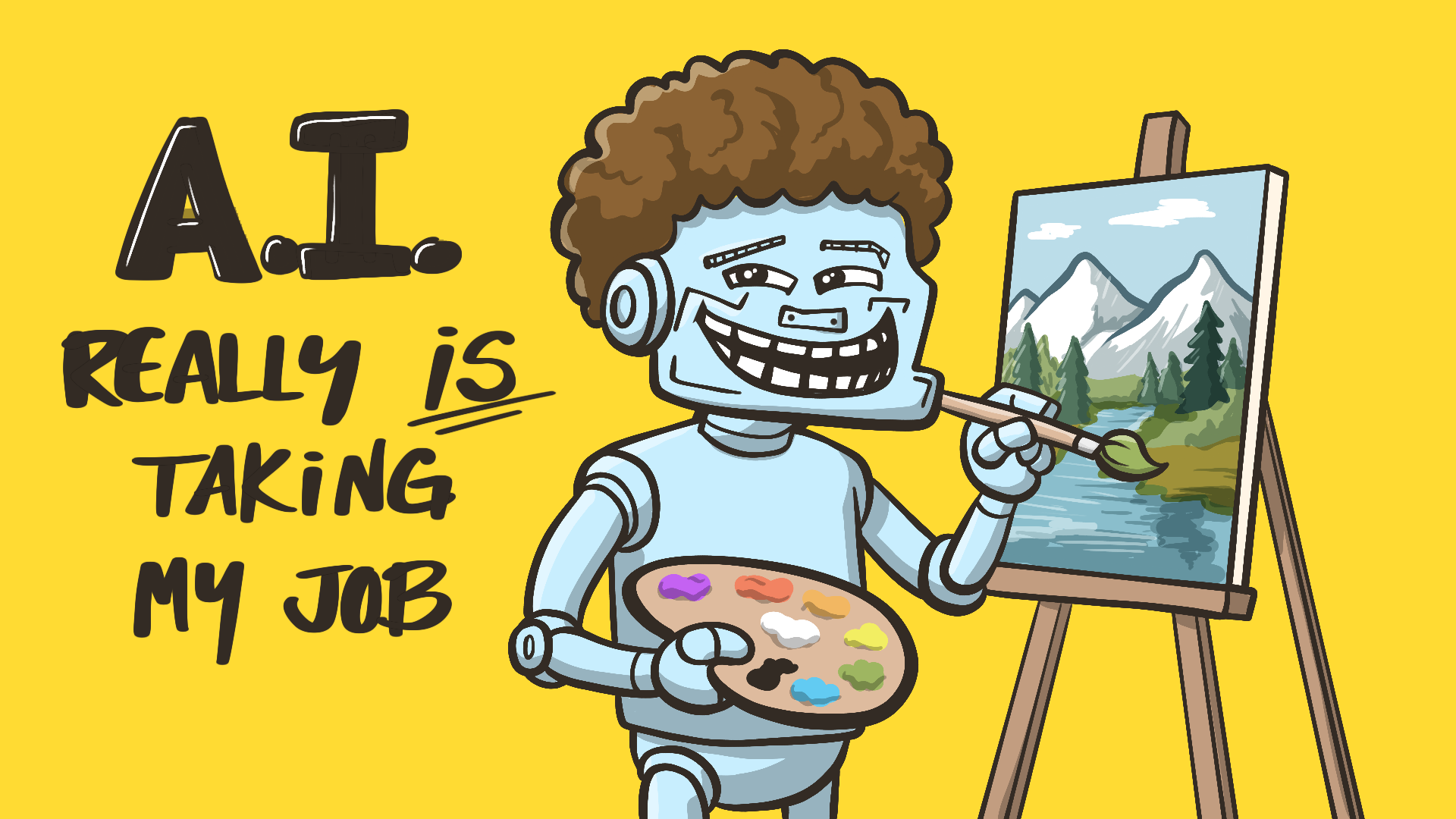
A creative professional details their complex relationship with generative AI. While initially embracing its creative boost and efficiency, they've seen their illustration business decline by over 50% due to AI tools' accessibility. They lament the potential loss of traditional skills but also acknowledge the innovation and possibilities AI offers, envisioning a future where new creative methods leveraging AI will emerge.

Typographic Rivers: A Curious Case of Accidental Alignment

2025-05-19
Typographic Rivers: A Curious Case of Accidental Alignment

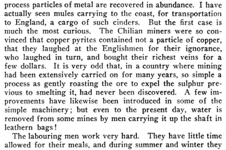
Have you ever noticed how sometimes the spaces between words in printed text coincidentally align to form vertical 'rivers' of whitespace? This phenomenon, most common in monospaced fonts with full justification, is generally avoided by typographers due to its distracting nature. The article cites a classic 12-line example discovered in 1988 and a collection from 1986, highlighting the intriguing randomness of this typographic quirk.

Design

Ugly Infrastructure: Stifling the West's Future?

2025-05-19
Ugly Infrastructure: Stifling the West's Future?

This article explores the lack of aesthetic consideration in Western infrastructure. The author contrasts the beauty of Ireland's Mary McAleese Bridge with the ugliness of much other infrastructure, arguing that aesthetics aren't an added cost, but a key to improving quality of life and promoting social development. Examples of aesthetically pleasing infrastructure from around the world are cited, highlighting how the absence of beauty leads to public resistance and ultimately, massive economic waste, as seen with the UK's HS2 project. The author calls for prioritizing aesthetic design in infrastructure, integrating art to build a better future.

The Death of Print and the Rise of the Font: A Meditation on Typography

2025-05-19
The Death of Print and the Rise of the Font: A Meditation on Typography

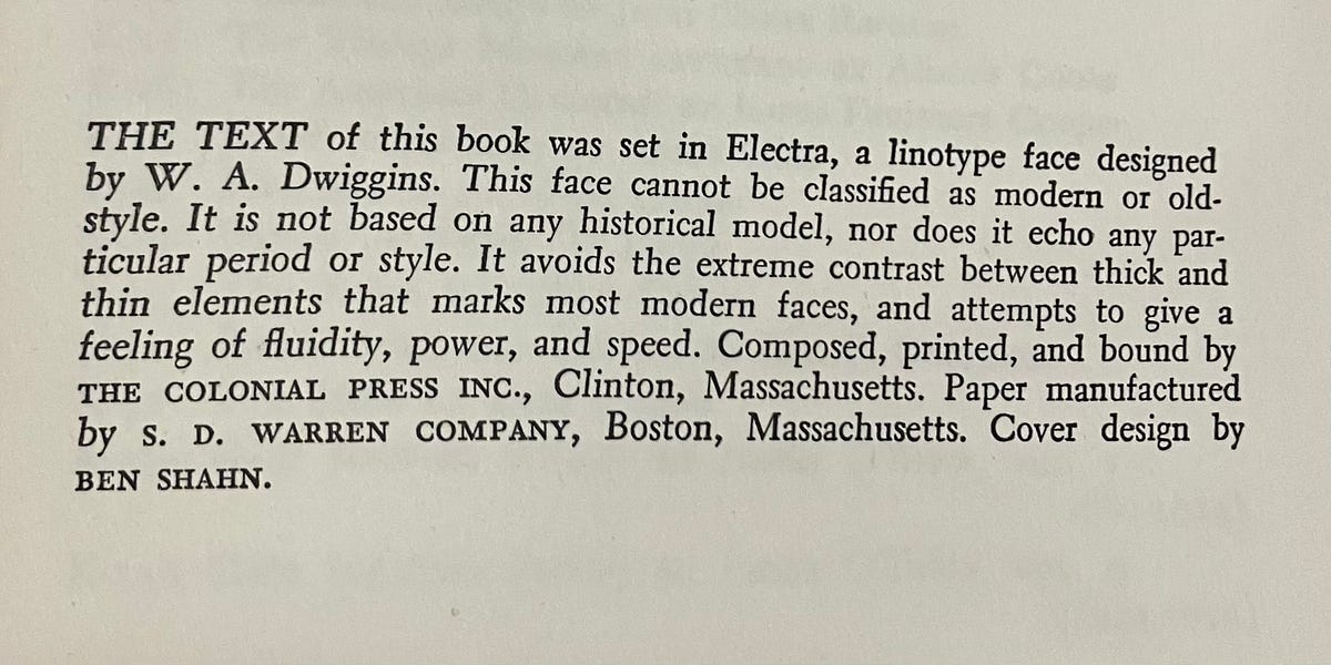
This article explores the evolution of the 'Note on the Type' found in books. From early printing houses' meticulous descriptions of typographic craft to the contemporary digital age's renewed focus on fonts, the author traces the history of font design in publishing. Once considered an internal communication among professionals, the 'Note on the Type' takes on new meaning in the context of the digital age. With the decline of print and the rise of digital content, font design may become the sole remaining avenue for creative expression in our interaction with text, prompting deep reflections on the meaning and expression of words.

Nadar: Portraits of a Gilded Age

2025-05-19
Nadar: Portraits of a Gilded Age

In 1862, Japanese envoys first visited Europe, witnessing the marvels of the Industrial Age. Meanwhile, Parisian photographer Nadar captured the era's iconic figures through his lens: from the Japanese samurai to poet Baudelaire, from painter Manet to novelist Hugo. Nadar's portraits transcended mere likenesses, revealing the vibrant personalities and zeitgeist of their time. This article explores 19th-century Parisian culture and the impact of technological change through the lens of Nadar's famous subjects.

Design 19th century

34 Ingenious Paper Mechanisms: A Showcase of Folding Engineering

2025-05-18

This article showcases 34 remarkable paper mechanisms, ranging from simple animated folds to complex rotating contraptions. These designs demonstrate the boundless possibilities of paper engineering, combining artistic aesthetics with intricate mechanical principles and folding techniques. Highlights include a Miura-fold inspired deployable solar panel and various geometrically driven dynamic structures, showcasing the intersection of art and engineering in paper design.

Terrence Malick: A Cinematic Enigma

2025-05-16
Terrence Malick: A Cinematic Enigma

Terrence Malick, the reclusive American director, has captivated and perplexed audiences for decades. This piece explores Malick's career, from his debut with *Badlands* to his recent work, *A Hidden Life*. His films, lauded by some as masterpieces and dismissed by others, are marked by stunning visuals and a profound exploration of nature, faith, and the human condition. His unique approach, evolving from a focus on visual beauty to a deeper engagement with existential questions, challenges viewers to contemplate the role of cinema itself.

Material 3 Expressive: 4x Faster UI Element Discovery

2025-05-16
Material 3 Expressive: 4x Faster UI Element Discovery

Google's research demonstrates that Material 3 Expressive design significantly improves user experience through strategic use of color, size, shape, and layout. Eye-tracking studies show users locate key UI elements up to four times faster in Expressive designs, with key action tap times reduced by seconds. For example, in a redesigned email app, the 'Send' button is larger, better positioned, and uses a secondary color for better visibility, resulting in significantly faster user interaction. This highlights the effectiveness of Expressive design principles in guiding user attention and improving efficiency.

Design

LA Architecture Hack: Wearable Protest Suits

2025-05-16

Archisuit is a project featuring four leisure jogging suits designed around specific architectural structures in Los Angeles. The suits incorporate the negative space of these structures, allowing wearers to comfortably occupy spaces designed to exclude them. The project critiques architecture's role in policing and controlling bodies based on race, class, and gender, suggesting that comfortable presence can be an act of resistance.

Revolutionizing Mac Design: An Interview with Jef Raskin

2025-05-15
Revolutionizing Mac Design: An Interview with Jef Raskin

This 1986 interview features Jef Raskin, an early Macintosh designer. Raskin sharply criticizes complex UI design, sharing his philosophy behind SwyftCard (an Apple II application). Central to his approach are 'modelessness' and 'monotony': each action has one result, and each result has one action, fostering user habits and efficiency. He criticizes the Mac's eventual adoption of a traditional OS and mouse, arguing that good UI design prioritizes speed and user experience over technical complexity. Raskin's insights remain relevant to modern UI/UX design.

Design

Celtic Coins: Crude or Sophisticated?

2025-05-14
Celtic Coins: Crude or Sophisticated?

Celtic coins are often dismissed as crude, a misconception this article challenges. By tracing the evolution of Celtic coin designs, it reveals a unique abstract art style. Initially mimicking Greek coins, the Celts developed a distinctive approach: breaking down images, abstracting them, and reassembling them in a way that reflected their aesthetic and spiritual beliefs. This wasn't crudeness, but a sophisticated artistic expression, the appreciation of which hinges on understanding the underlying symbolism and the serial nature of the imagery's evolution.

Hollywood's Story Formula: Myth or Shackle?

2025-05-14
Hollywood's Story Formula: Myth or Shackle?

This article delves into the prevalent three-act narrative structure used in film and television, tracing its roots back to Aristotle and its widespread adoption in Hollywood. While acknowledging its commercial success, the author questions its repetitive and conservative nature. It masks the underlying structure, reinforces the status quo, and potentially hinders critical thinking about reality. The article also explores alternative narrative forms, such as cyclical and fragmented narratives, and calls for filmmaking to better reflect the fragmentation and complexity of contemporary society.

Design

Alephic's Writing Style Guide: Concise, Precise, and Bold

2025-05-13
Alephic's Writing Style Guide: Concise, Precise, and Bold

Alephic's comprehensive writing style guide prioritizes conciseness, precision, and a bold voice. It outlines core principles like active voice, data-driven claims, and clear structure. The guide emphasizes Alephic's unique brand voice: intellectually bold, ambitiously grounded, and radically simple. It covers documentation best practices, AI collaboration strategies, and a robust editing process, ensuring all Alephic writing is clear, compelling, and effectively communicates its message.

90s Web Design Nostalgia: Modernizing Image Maps

2025-05-13
90s Web Design Nostalgia: Modernizing Image Maps

This article details the author's experience designing a website for Emmy-award-winning game composer Mike Worth. To evoke a 90s animation style, the author initially explored using image maps, but discovered limitations regarding responsive design. By combining SVG paths with embedded anchors and leveraging CSS and a small amount of JavaScript, the author successfully created a web design that blends 90s aesthetics with modern technical advantages, demonstrating creative problem-solving with older technologies.

Design

Google's Iconic 'G' Logo Gets a Refresh After a Decade

2025-05-13
Google's Iconic 'G' Logo Gets a Refresh After a Decade

After nearly 10 years, Google has updated its iconic 'G' logo. The update blends the previously distinct color sections for a smoother, more vibrant look. The new icon is already rolling out to the iOS Google Search app, and has arrived on Android with Google app 16.18 (beta). This subtle but noticeable change reflects Google's ongoing commitment to modernizing its brand identity, aligning with the gradient style seen in Google Gemini AI.

Barbican Estate: A Labyrinthine Utopia in London

2025-05-12
Barbican Estate: A Labyrinthine Utopia in London

Three years after discovering the Barbican Estate online, the author finally visited this unique London complex built between 1965 and 1976. A two-hour resident-led tour revealed a fascinating blend of history, design, and hidden secrets. From underground parking garages filled with abandoned cars to Roman and medieval ruins, even a 1,000-year-old Jewish burial ground, the Barbican is far more than just housing. Inspired by ancient Egyptian and Battalion architecture, it features hidden passages and a dedicated online forum for residents. The article recounts the author's experience and recommends books for a deeper dive into this captivating place.

Design Barbican

The Surprisingly Colorful World of 1888 Ostrich Feather Dyeing

2025-05-10
The Surprisingly Colorful World of 1888 Ostrich Feather Dyeing

Alexander Paul's *The Practical Ostrich Feather Dyer* (1888) is a surprisingly vibrant volume. Interspersed with detailed instructions and color adjustments, are 48 stunning examples of dyed ostrich feathers, showcasing a remarkable range of hues – from lemon yellow to deep browns. Paul's confidence in his methods is evident; he offers a $1000 reward to anyone who can disprove his instructions. This book isn't just a technical manual; it's a testament to meticulous craftsmanship, precision, and an egalitarian entrepreneurial spirit.

Anarchitecture: A 1970s NYC Art Collective's Rebellion Against Modernist Architecture

2025-05-09

In 1970s New York, the artist collective Anarchitecture, comprising figures like Laurie Anderson and Gordon Matta-Clark, challenged the rigidity of modernist architecture and its complicity in capitalist production. Their 1974 exhibition, similarly titled, anonymously showcased works critiquing architecture as a symbol of cultural excess. Matta-Clark's later 'building cuts' further explored this theme, transforming abandoned structures to expose society's obsession with material wealth. Concurrently, the group ran the influential restaurant 'Food' in SoHo, supporting a local artist network. Anarchitecture's work posed profound questions about modern architecture and urban space.

Stunning Note-Taking App: UI Design and Functionality Perfected

2025-05-09
Stunning Note-Taking App: UI Design and Functionality Perfected

This note-taking app boasts not only strong encryption but also a stunning user interface: intuitive, responsive, and customizable. Features like a folder tree in the left pane, a rich text editor (truly rich and classic), and an automatically generated clickable table of contents (showable/hidable via a hamburger menu, perfect for mobile) showcase its elegant design. A simple calendar, colorful tags, and Monday-starting weeks further enhance the experience. Support for other file types looks even more promising!

Design

Towards the Blank Search Bar: Information Overload and Design Failures

2025-05-08

Starting with a simple bookmark misclick, the author explores the negative impacts of recommendation algorithms in the age of information overload. Too many options can disrupt user decision-making, reduce efficiency, and even lead to 'choice paralysis'. The author suggests that website design should be user-centered, offering the option to turn off recommendations, avoiding unintentional autocompletion, and starting with a blank interface, allowing users to choose the features they need. This article not only discusses the personal experience of information overload but also raises ethical considerations about algorithmic recommendation mechanisms, calling for more human-centered design principles.

Turner: A Misunderstood Genius

2025-05-08
Turner: A Misunderstood Genius

J.M.W. Turner, the master of British landscape painting, lived a life shrouded in mystery. A child prodigy who achieved early fame, his later works were so radical they baffled his contemporaries, even suggesting mental illness to some. He lived a secretive life in modest lodgings, despite amassing great wealth and numerous properties. Turner's relentless pursuit of landscape stemmed from personal travels and his admiration for Claude Lorrain, culminating in his unique atmospheric landscapes that conveyed awe through light, color, and atmosphere. While controversial in his time, he's now celebrated as a precursor to avant-garde art, his extraordinary achievements securing his place in art history.

Algorithmic Design with Grasshopper: A Visual Programming Tutorial

2025-05-08
Algorithmic Design with Grasshopper: A Visual Programming Tutorial

This tutorial introduces visual programming in Grasshopper, a plugin for Rhino 3D. Grasshopper allows algorithmic generation of geometry by connecting data and functions within a visual diagram. The tutorial covers the basics of creating points, lines, polylines, curves, and surfaces using various components and parameters. Learn to construct points using the 'Construct Point' component, create lines with the 'Line' component, and generate curves with the 'Interpolate' component, among others. This hands-on guide empowers designers to create complex 3D models efficiently.

Mac Themes Garden: A Showcase of 4000+ Classic Mac Themes

2025-05-07
Mac Themes Garden: A Showcase of 4000+ Classic Mac Themes

After years of running a bot that showcased classic Mac themes, the creator has launched Mac Themes Garden, a website featuring over 4000 Kaleidoscope themes from the Classic Mac era. The author painstakingly documented each theme, taking screenshots and gathering author information. Built with Astro, the site boasts nearly 5000 pages and meticulously recreates the look and feel of Mac OS 9 using CSS. Beyond download functionality, it includes author pages and an RSS feed for updates. Future plans include a color search, custom icon display, and a user-submitted gallery.

Realistic Bread Wrapping Paper: Your Gifts Become Bread!

2025-05-07
Realistic Bread Wrapping Paper: Your Gifts Become Bread!

Japanese graphic designer Ippei Tsujio has created ultra-realistic bread wrapping paper that transforms gifts into lifelike loaves. From baguettes to ciabatta, the toasty brown hues, flour dusting, and hand-scored patterns mimic freshly baked bread. While currently just a concept, this creative wrapping paper is mouthwatering and may one day become a real product.

Retro Monospace Fonts: Old Timey Mono & Code

2025-05-06
Retro Monospace Fonts: Old Timey Mono & Code

Darren Embry has released two retro-styled monospace fonts: Old Timey Mono and Old Timey Code. Old Timey Mono is based on the Reproducing Typewriter typeface from as early as 1906, aiming to simulate typewritten text while enhancing readability. Old Timey Code builds upon this, adding a slashed zero, a more distinct digit one, and modifications to select punctuation marks and lowercase letters. Both fonts boast extensive language support, covering Latin, Cyrillic, and Greek scripts, and a wide range of Unicode character sets, making them ideal for coding and screenwriting.

Design coding font
1 2 4 6 7 8 9