Category: Design

Manhattan's Hardest-Working Font: The Mystery of Gorton

2025-02-14
Manhattan's Hardest-Working Font: The Mystery of Gorton

This article details the author's obsessive quest to uncover the story behind Gorton, a surprisingly ubiquitous yet unassuming font. Initially used with engraving machines, its rugged durability led to widespread adoption in diverse contexts, from keyboards to spacecraft. The author's years-long search, spanning countless miles and locations, reveals Gorton's century-long history, tracing its origins to a UK lens maker and its subsequent evolution through various iterations like Leroy. While far from perfect, Gorton's charm lies in its imperfections and enduring presence, solidifying its status as Manhattan's hardest-working font.

The Secret History of Wari Textiles: Looting and the Transformation of Andean Art

2025-02-14
The Secret History of Wari Textiles: Looting and the Transformation of Andean Art

Wari textiles represent some of the most remarkable examples of Andean fabric art. However, their study is hampered by unclear provenance, with many pieces entering global collections through illicit means. The lack of archaeological context makes it difficult to understand their original function and significance. Experts have documented instances of alteration, including cutting, cropping, and restitching, transforming these garments from multi-sensory ensembles worn on the body into flat art objects for Western consumption. This manipulation obscures their original cultural context and purpose.

Lost in Love: A Generative Art Maze Based on Names

2025-02-14
Lost in Love: A Generative Art Maze Based on Names

Bèr Kessels' "Lost in Love" is a generative art project that creates a unique maze based on two names provided by the user. Using a recursive backtracking algorithm, the project animates the maze generation process. The maze's design is determined by randomness seeded from the names, offering no customization options. The aim is to create unique artwork based solely on the two names. The code is open-source and available on GitHub.

The Embodied Alphabet: From Renaissance Humanism to Pedagogical Commentary

2025-02-13
The Embodied Alphabet: From Renaissance Humanism to Pedagogical Commentary

Typographic characters have long been linked to the human form. Renaissance figures like Luca Pacioli and Geoffroy Tory used human anatomy as a basis for letter proportions, as seen in Peter Flötner's 1534 woodcut 'Menschenalphabet'. Later works, such as 'The Comical Hotch Potch' (1782), shifted the focus, using the alphabet to subtly comment on the character-forming aspects of education, depicting figures comically contorting themselves to mimic letter shapes.

YouTube's Subtle Redesign: A Refined Red

2025-02-13
YouTube's Subtle Redesign: A Refined Red

YouTube subtly refreshed its branding, focusing on its iconic red. The previous pure red had technical issues, appearing orange on some screens and potentially causing screen burn-in. The new red is a slightly cooler shade, addressing these problems while maintaining a vibrant, approachable feel. This wasn't a revolutionary overhaul, but a careful refinement, aiming to improve user experience across devices and screens while staying true to the brand's identity.

The AI Design Paradox: Convenience vs. Creativity

2025-02-12
The AI Design Paradox: Convenience vs. Creativity

A veteran designer explores the double-edged sword of AI design tools. While AI offers rapid design generation, it simultaneously compresses the design process, eliminating the 'productive void' – those crucial moments of waiting, exploration, and iteration where inspiration blossoms. The author argues this 'process collapse' risks shallow, unoriginal designs and expresses concern about AI's potential to diminish human creativity. He urges designers to use AI cautiously, viewing it as a tool for expanding, not compressing, creativity, and to value the friction and reflection inherent in the design process.

Disney's 'Go Away Green': Camouflaging Infrastructure

2025-02-12
Disney's 'Go Away Green': Camouflaging Infrastructure

Disney Parks utilize a range of muted colors, including various shades of green, gray, brown, and blue, dubbed "Go Away Green," to seamlessly blend infrastructure like speakers, fences, and trash cans into the environment. This clever camouflage technique, inspired by military colors, minimizes distractions and enhances the immersive experience, focusing visitor attention on the attractions rather than the park's functional elements. The strategy is applied to large buildings and smaller infrastructure alike.

WFH in 2020: A Nostalgic macOS 9 Workflow

2025-02-10
WFH in 2020: A Nostalgic macOS 9 Workflow

This article reflects on the author's work-from-home experience during the COVID-19 pandemic in 2020. It contrasts that workflow with the tools of today and the limitations of yesterday, such as unreliable internet, limited disk space, and macOS 9, creating a nostalgic 'Mac(os)talgia' experience.

Design Nostalgia

Crafting Stunning Post-Processing Effects with Shaders

2025-02-09
Crafting Stunning Post-Processing Effects with Shaders

This article details the author's 2024 journey learning shader techniques and applying them to post-processing. Inspired by artists like @samdape and @hahajohnx, they created intricate pixel patterns, trompe l'oeil effects, and interactive post-processing. The article dives deep into the techniques behind pixelation, creating patterns using SDFs and threshold matrices, and achieving effects like LED panels, woven fabric, Lego bricks, and frosted glass. Code snippets and demos are provided.

Data Visualization: Beyond Illustration, Towards Elucidation

2025-02-07
Data Visualization: Beyond Illustration, Towards Elucidation

This article praises innovative approaches to visualizing mathematical formulas. Using Daniel Fleisch's book on Maxwell's equations as an example, it argues that formulas in traditional academic papers are often opaque, while good visualizations clarify complex information, achieving 'elucidation' rather than mere 'illustration'. This aligns with Edward Tufte's concept of 'visual explanation', advocating for the power of data visualization to make complex information easily understandable.

Wright's Paradox: Organic Architecture vs. Mile-High Skyscraper

2025-02-06
Wright's Paradox: Organic Architecture vs. Mile-High Skyscraper

The architectural world is divided on the issue of density: pro-density advocates for dense, centralized cities, while anti-density champions decentralized, sprawling suburbs. Frank Lloyd Wright, a renowned architect known for his organic approach emphasizing a building's connection to its surroundings, belonged to the latter camp. His Broadacre City exemplifies this philosophy. Ironically, Wright also designed a mile-high skyscraper, 'The Illinois,' a stark contrast to his organic principles, prompting reflection on the compatibility of organic architecture and high-rise buildings.

Rick in 240 Lines of Code: A Stunning GLSL Animation

2025-02-06
Rick in 240 Lines of Code: A Stunning GLSL Animation

This article details the author's eight-month journey creating a breathtaking Rick animation using only 240 lines of GLSL code, no libraries, and no images. The author embeds a live coding editor within the post, allowing readers to program their own animations. The process is explained step-by-step, from basic color fills to using signed distance functions (SDFs) like Bézier curves, stars, and rounded rectangles to meticulously craft Rick's features and hair. Noise functions and time domain warping bring dynamic effects to Rick's hair and add random eye movements. The author shares various animation techniques, including looping values, switching drawn content, and noisy movement, providing complete code and explanations to empower readers to create their own GLSL animations.

Design code art

Reimagining US County Maps with Hexagonal Tiling: A Novel Data Visualization Approach

2025-02-05

This article introduces an innovative data visualization technique: tiling all US counties into a uniform grid of hexagons. This approach overcomes the bias introduced by varying county areas in traditional maps, allowing for clearer representation of population density, socio-economic variables, and more. The unique gapless tiling property of hexagons avoids the "edge effect" of square grids, more accurately depicting county adjacency. Visual cues like color intensity or size adjustments highlight differences in population density, economic indicators, public health data, and other metrics across counties. Filtering by state or region allows for focused analysis, making this a versatile tool for policymaking and regional development.

Design hexagons

Lean Design Meets Cybernetics: The User Defines Purpose

2025-02-05
Lean Design Meets Cybernetics: The User Defines Purpose

This article explores design from a cybernetics perspective, drawing on the ideas of theorists like Ashby and Beer. It discusses Ashby's Law of Requisite Variety, highlighting the need for sufficient variety in a system regulator to handle perturbations. The author introduces the "user purpose hypothesis" and the "counteraction hypothesis," arguing that users ultimately determine a device's purpose and seek simplification or complexification based on its perceived complexity. The article also explores Poka-Yoke (error-proofing) in lean principles, the cost of variety in design, and the importance of immediate feedback, using the USB design as a case study balancing cost and user experience. Finally, the author cites Krippendorff, emphasizing that an artifact's meaning isn't inherent but assigned by the user through interaction, urging designers to focus on empowering users rather than designing specific products.

Design Cybernetics

CSS Hover Animation: Clever Use of Inverted Radius Shape

2025-02-02
CSS Hover Animation: Clever Use of Inverted Radius Shape

This article demonstrates a method for creating a cool hover animation effect using CSS. By cleverly combining an inverted radius shape, CSS variables, and `@property`, a smooth reveal animation is achieved where text gradually appears on hover. The code is concise and efficient, leveraging CSS masks and gradients for a visually stunning effect. This is a valuable CSS technique worth learning, suitable for developers with some CSS experience.

Design CSS tricks

Photographer's iPhone Odyssey: Newsstands NFT Collection Sells Out

2025-02-01
Photographer's iPhone Odyssey: Newsstands NFT Collection Sells Out

Photographer Trevor Traynor embarked on a global journey from 2012, documenting vibrant newsstands worldwide using only iPhones. In 2022, he transformed these images into a collection of 100 unique NFTs, which sold out within months. The project culminated in a physical exhibition in Los Angeles, blending online and offline experiences. This showcases a successful fusion of photography, NFT technology, and art.

Design

Web Design: From Templates to Expression

2025-01-31
Web Design: From Templates to Expression

In 2010, a custom website was a designer's digital calling card. Developers harnessed HTML5's capabilities to create imaginative websites. But the rise of templates and automation led to homogenization. Today, browser technology has advanced significantly, yet many designers remain stuck in old paradigms. This article calls on designers to utilize new CSS features like HSL and OKLCH color spaces, and container queries, to break free from template limitations and create more expressive websites. Websites should be more than just information containers; they're a space for creative expression.

Great Question is Hiring a Lead Product Designer

2025-01-30
Great Question is Hiring a Lead Product Designer

Great Question, a seed-stage startup backed by Y Combinator and Funders Club, is hiring a Lead Product Designer. They're building an all-in-one customer research platform used by companies like Gusto, Experian, Canva, and Brex. The role requires 7-12 years of experience in software product design, with a focus on B2B SaaS and enterprise clients. The ideal candidate will be a strong leader with excellent UX design skills, capable of independently leading the design of complex product areas from conception to launch.

The Accidental Revolution: Making Gorillaz's Iconic 'Clint Eastwood' Music Video

2025-01-29
The Accidental Revolution: Making Gorillaz's Iconic 'Clint Eastwood' Music Video

This article features an interview with Pete Candeland, the director behind Gorillaz's groundbreaking 'Clint Eastwood' music video. Candeland recounts the challenges and serendipitous moments during production, detailing how he ingeniously combined 2D hand-drawn animation with 3D CGI on a limited budget. He drew inspiration from films like 'Natural Born Killers', 'Pulp Fiction', and 'The Matrix', utilizing experimentation and post-production editing to create a unique visual style that remains influential. This isn't just a behind-the-scenes look at a music video; it's a story of innovation, creative breakthroughs, and artistic fusion.

Design Music Video

Recreating Delicious Library in 2025?

2025-01-29

The author, a long-time admirer of Delicious Library's design since the early 2000s, recounts multiple attempts to recreate its functionality as a web app. From internal tools like Code Helper to independent projects like catalog.im and various design concepts, the author's journey reflects a persistent pursuit. The article concludes with a proposal for a new web-based Delicious Library, soliciting reader feedback and sparking discussion about merging nostalgic software design with modern web applications.

Design

A 1920s Art Party with Tamara de Lempicka: A Glimpse into Decadence

2025-01-26
A 1920s Art Party with Tamara de Lempicka: A Glimpse into Decadence

Imagine a glamorous 1920s party hosted by the iconic Tamara de Lempicka. This article vividly portrays the era through descriptions of Lempicka's art and the party's attendees. From Lempicka herself, arriving in her green Bugatti, to fashionable flappers in loose dresses, a guitarist in a blue satin gown, gossiping ladies in red hats, and androgynous figures like the Duchess de la Salle, the piece captures the unique fashion, art, and social atmosphere of the 1920s. Lempicka's artistic style is woven into the narrative, highlighting her use of classical references and her distinctive portrayal of modern women.

Snap Scope: Find Your Perfect Focal Length

2025-01-24
Snap Scope: Find Your Perfect Focal Length

Snap Scope is an app that helps you discover your favorite focal lengths. By analyzing your existing photos, it intelligently identifies your commonly used focal ranges and recommends lenses you might like. Say goodbye to focal length decision paralysis; Snap Scope helps you easily find the best shooting angle and improve your photography.

Design focal length app

Tele-Present Wind: An Art Installation Bridging Continents

2025-01-24

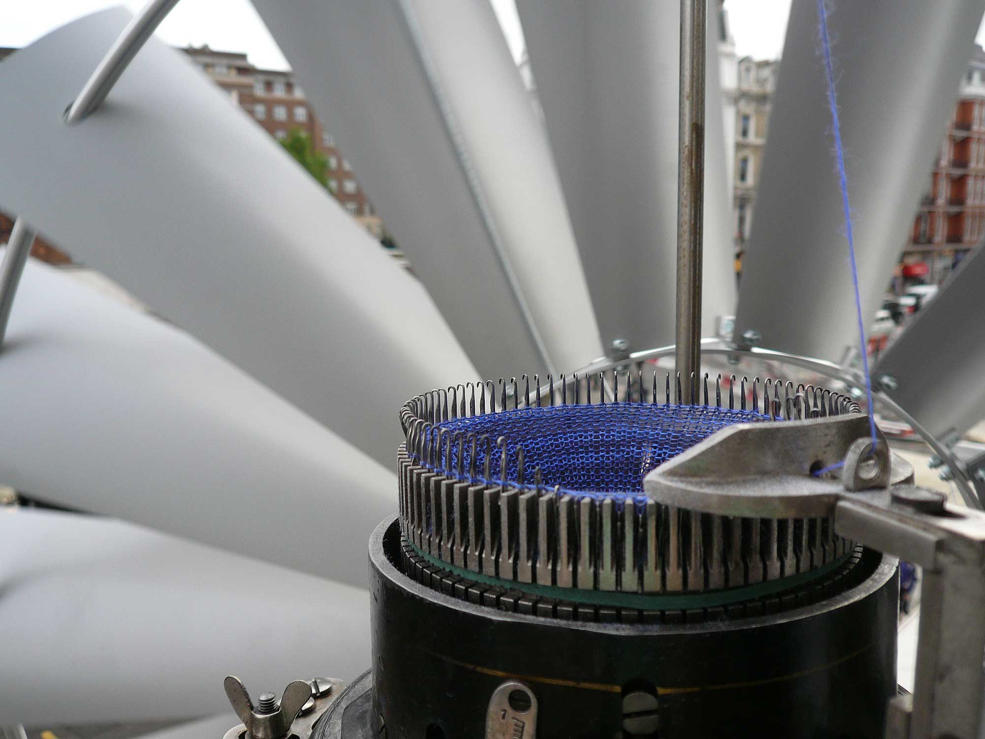
David Bowen's 'Tele-Present Wind' art installation uses an accelerometer connected to a plant stalk outdoors and 126 mechanical devices in a gallery to simulate wind in real-time. Whether in Bilbao, Spain or Moscow, the installation precisely captures and displays the wind's movement from a location near the University of Minnesota's Visualization and Digital Imaging Lab, thousands of miles away. This seamlessly blends technology and nature, creating a powerful artistic representation of environmental forces.

Design sensor

cs16.css: A CSS Library Inspired by Counter-Strike 1.6

2025-01-24
cs16.css: A CSS Library Inspired by Counter-Strike 1.6

cs16.css is a CSS library inspired by the user interface of Counter-Strike 1.6. It offers a clean and easy-to-use style for various common components, including buttons, checkboxes, input fields, dropdown menus, radio button groups, sliders, dialogs, tooltips, progress bars, and tabs. Simply add the CSS link to your HTML's `` tag to get started. The library is available on GitHub under the MIT license.

UI Hell: The Case of the Four-Function Calculator

2025-01-24
UI Hell: The Case of the Four-Function Calculator

This article delves into the surprisingly complex UI design of a seemingly simple four-function calculator. Starting with the basic components—ten digit keys, operators, and an equals sign—the author reveals hidden complexities. Issues like handling continuous operations, negative number input, implicit equals, and the legacy 'K-constant' feature are explored. These seemingly minor details lead to inconsistencies and user confusion, highlighting the challenges in designing even the simplest of devices. The author uses humor and diagrams to illustrate the intricate logic and historical evolution of calculator UI, prompting reflection on the design nuances often overlooked in everyday objects.

Design Calculator

Ben Pence's Portfolio: A Clean Showcase of Design & Development Skills

2025-01-23

Ben Pence's website is a clean and effective portfolio showcasing his skills as a designer and developer. The minimalist design highlights his work, featuring a range of projects including web design, branding, and interactive experiences. His carefully curated case studies demonstrate expertise in visual design and UX, while readily available contact information allows for easy outreach from potential clients or collaborators. Overall, it's a highly effective and impressive personal portfolio reflecting professionalism and attention to detail.

Banish WFH Eye Strain: Optimizing Your Home Office Lighting

2025-01-22
Banish WFH Eye Strain: Optimizing Your Home Office Lighting

Working from home causing eye strain? Blogger Russell Baylis shares his journey to optimal lighting, emphasizing even, diffused light as key to reducing eye fatigue. He transformed his workspace with floor lamps and dimmable lights, eliminating harsh shadows and high contrast. Natural light is softened with diffusing curtains, and high-quality, flicker-free lighting is prioritized. The 20-20-20 rule and regular breaks are also stressed for eye health.

Life in Another Light: 2024 Infrared Photography Contest Winners Announced

2025-01-22
Life in Another Light: 2024 Infrared Photography Contest Winners Announced

The Atlantic features the winners of the 'Life in Another Light' biannual infrared photography competition. Over 3,000 entries from photographers worldwide were judged across 11 categories. The winning images, showcasing the unique perspectives of infrared photography, offer a captivating glimpse into nature and humanity. The winning photographs span landscapes, portraits, and astrophotography, highlighting the versatility of the medium.

The Definitive Guide to Jens Quistgaard's Dansk Peppermills

2025-01-21

This website is a comprehensive guide to the collection of peppermills designed by Jens Quistgaard for Dansk Designs. Each mill is meticulously documented, detailing its unique shape, model number, grinder type, and production history. The site unravels the stories behind these iconic designs, revealing the evolution of their forms and manufacturing processes. From the earliest all-metal grinders to later plastic variations, this resource is a must-have for collectors and design enthusiasts alike.

1 3 5