Langfuse Launches Customizable Dashboards: Unleashing the Power of LLM Usage Data
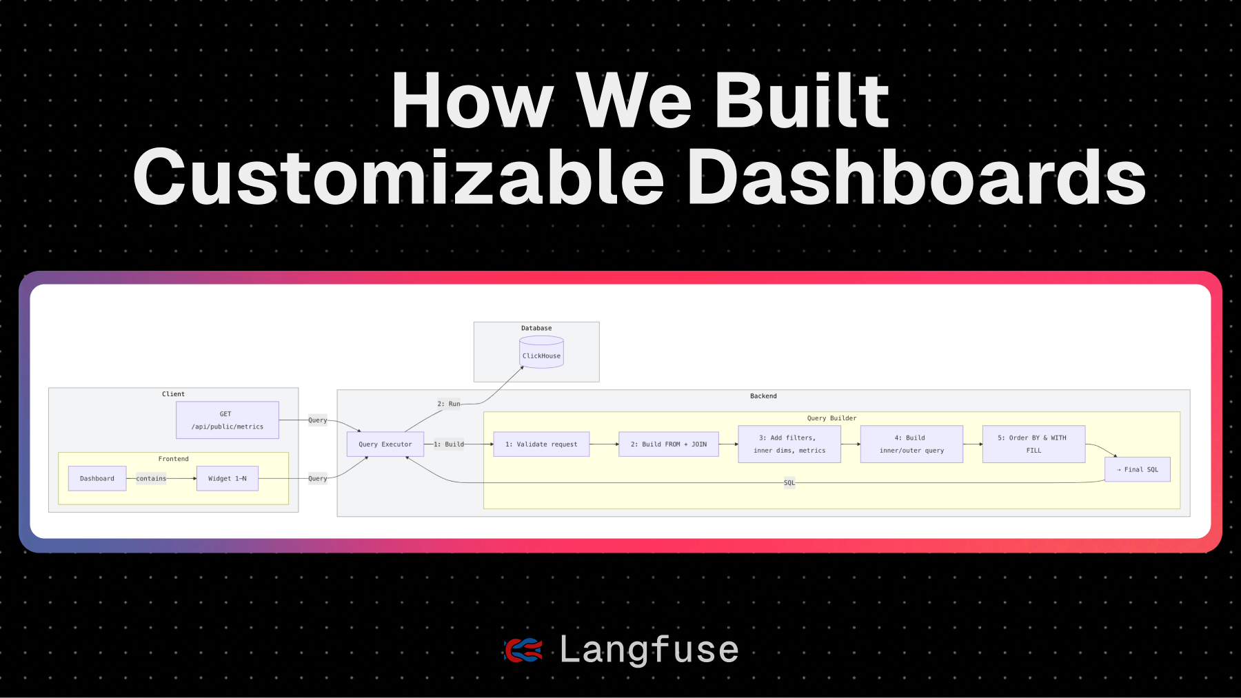
On Day 3 of Langfuse's launch, they introduced customizable dashboards: a powerful way to visualize LLM usage directly within the Langfuse UI. Whether you want to track latency trends, monitor user feedback, or correlate cost with performance, the new dashboards let you build the charts you need, right where you need them. For those preferring their own analytics stack, the same querying capabilities are available via their API. This post details the journey from product ideation to technical implementation, testing, and rollout, sharing lessons learned in building flexible, real-time insights into your LLM pipelines. By abstracting the data model, building a flexible and performant query engine and dashboard builder, Langfuse successfully delivered customizable dashboards, iterating through beta testing and user feedback to add more chart components, resizable widgets, improved tooling, and even Langfuse-managed dashboards offering valuable pre-built themes.